Wednesday, August 17, 2011

#50 Jennifer Bartlett


Jennifer Bartlett was born in Long Beach California in 1941. In 1963 she received her BA from Mills College in Oakland, California. While studying at Mills College in Oakland she met mixed media sculptor Elizabeth Murray. In 1965 Bartlett received her MFA from the Yale School of Art and Architecture. During this time minimalism was at a high point. Jennifer is considered to be a conceptual artist.


Bartlett is best known for her paintings and prints that contain subjects that are considered be me mundane such as houses. They are treated both as realistic and also abstract. In 1981 Jennifer created a 200 foot mural for the Federal Building in Atlanta Georgia. Bartlett has work in many collections such as the Cleveland Museum of Art, The Contemporary Museum, The Tate Gallery, and the Whitney Museum of American Art just to name a few.


#49 Alexander Ney


Alexander Ney was born in 1939 in Leningrad, Russia. He is an American sculptor and painter. He immigrated to the United States in 1974 and has lived and worked in New York ever since. Alexander developed many individualistic styles of modern art but he is most famous for his unique work in Terra cotta sculpture that are heavily perforated surfaces and intriguing forms.


Ney's childhood was not an easy one. He was born into the time of World War II when the Siege of Leningrad was launched, this is marked by historians as the second most lethal battle in the wars tragic history. The cities rail connections were severed cutting off all access to and food and power supplies. That following winter between two and three million civilians were killed during the Leningrad Blockade, including 400,000 children. Alexander was given private art lessons from Russian sculptor V.V. Lishev. After receiving these private lessons Ney decided to study at the Art School of the Leningrad Academy of Arts from 1954-1957. Next he attended the Art School at the Surikov Moscow Art Institute from 1957-1959. Ney befriended many progressive-minded art students who are now stars of the contemporary Russian art scene such as Leonid Sokov and Lev Nussberg. Ney was relentless at trying to create striking and new interpretations of art, this is what quickly made him legendary amongst his peers.


From 1965 to 1967 Ney taught sculpture to children at the house of Young Pioneers in Leningrad. In 1967 to 1969 he went back to school to study art history and theory courses.


#48 Chris Ofili


Chris Ofili was born on October 10, 1968 in Manchester. Chris is a British painter who is best known for his works of art that reference his Nigerian heritage and his incorporation of elephant dung. Ofili attended a catholic school which was a school for boys. After that he attended Xaverian College in Victoria Park Manchester. He also studied in London at the Chelsea School of Art from 1988 to 1991 and then at the Royal College of Art from 1991 to 1993. Ofili was established because of exhibits by Charles Saatchi at his art gallery in north London and also because of the traveling exhibition called "Sensation" in 1997. Because of this he became recognized as one of the few British artists of African/Caribbean descent to break through as a member of the "Young British Artists" group. Chris Ofili has had many solo exhibits since the early 1990s including the Serpentine Gallery. In 1992 Chris received a scholarship that allowed him to travel to Zimbabwe where he studied cave paintings that ended up having an effect on his style. With this new style he began to work with elephant dung that people though he splatter on his paintings but in reality he applies it to his painting in the form of round spheres, and he sometimes uses it as foot stands on his paintings. Not only do Ofili's painting reference his Nigerian Heritage they also reference gangster rap seeking to question racial and sexual stereotypes in humorous ways. His work is often build up in layers of different materials to create a collage. In 1998 Chris Ofili won the Turner Prize.


#47 Judy Chicago


"The Dinner Party"


I picked Judy Chicago for this post because when I took ceramics with professor Hayes we actually did a version of her "Dinner Party" to help support the food bank of Virginia. We had a No Dinner Dinner Party where everyone made "plates" that somehow represented hunger. For mine I made a set of hands holding up a piece cardboard that has written on it "will work for food".


Judy Chicago was born on July 20th 1939 in Chicago IL. She received her Bachelor Degree and Masters degree both at the University of California, Los Angeles in 1962 and 1964. Judy is another one of those artists that isn't just an artist she is an author, educator, feminist, and an intellectual whose career has now spanned over five decades. Just Chicago has been a huge influence both within and beyond the art community which can be shown by the numerous inclusions in publications throughout the world. Chicago's work has been on exhibit frequently in the United States and Canada as well as in Asia, Europe, Australia and New Zealand. In addition to her art exhibits many of the books she has written have also been published in foreign editions, which enables her to bring her art and philosophy to many readers around the world. After taking time off from teaching for 25 years in 1999 she returned to teaching at the University of Indiana, Bloomington. Although Judy has been an influential teacher and a prolific author her primary focus throughout her career has been her studio work. In 1974 Chicago turned her attention to the subject of women's history as she created her most well know work "The Dinner Party" which was executed from 1974 to 1979 with the participation of hundreds of volunteers. This was an extremely monumental multimedia project with was symbolic history of women in the western civilization. The Dinner Party has been seen by more than one million viewers during its sixteen exhibitions held at venues spanning six countries.


#46 Ashley Bickerton


I absolutely love Ashley Bickertons work. I especially love the use of bright colors. This one is my favorite of his because of the interesting look on the persons face. It almost looks like the person is pieced together from different features of other people. The eyes are the main part of this that really draw me into his work. The eyes are very intense and I think that is what makes this piece of work so wonderful.


Ashely Bickerton was born in Barbados in 1959. He studied at the California Institute of Arts where he graduated in 1982. Next he went on to study at the Whitney Museum Independent Studies program in New York. He continued to live and work in New York until 1993. Since living in New York Bickerton has moved to Bali where he currently lives and works. Bickerton has had exhibits worldwide and many of his works are included in many museums and public collections. Bickerton is considered to be a mixed media artist because he often mixes photographic and painterly elements with industrial and found objects. Ashley Bickerton has been associated with the 1980s art movement called Neo-Geo, which also includes artists Jeff Koons and Peter Halley. Bickertons work has explored the issues of contemporary art related to the commidification of the art object itself. The objects in Bickertons work are often grotesque in a self aware manner and are often a critique of capitalism.


http://www.whitecube.com/artists/bickerton/

http://en.wikipedia.org/wiki/Ashley_Bickerton

#45 Jasper Johns

"Flag"

Encaustic,oil and collage on fabric mounted on plywood


Jasper Johns was born on May 15, 1960 in Augusta Georgia. He spent the majority of his life living in South Carolina. Jasper started drawing at the age of three and has been creating art ever since. Jasper began his studies at the University of South Carolina where he studies for a total of three semester in 1947-1948. After that he moved to New York City where be studied briefly at the Parsons School of Design in 1949. He had a brief stint in the military where he was stationed in Sendai Japan from 1952-1953 during the Korean War. In 1954 Jasper returned to New York City where he met Robert Rauschenberg and they became long term lovers. Together they began to explore the contemporary art scene and began developing their ideas on art. In 1958 John's was discovered by gallery owner Leo Castelli while he was visiting Rauschenbergs studio. Castelli was the one who gave John's his first solo show and it was at this show that Alfred Barr the founding director of New York's Museum of Modern Art purchased four of his works of art. In 1963 Johns and Cage founded Foundation for Contemporary Performing Arts, which is now know and Foundation for Contemporary Arts in New York City. Jasper is best know for his painting Flag (1954-55) which he painted after he had a dream about the American flag. Johns work is often described and Neo-Dadaist as opposed to pop art, even though his work often included subject matter, images, and objects from popular culture. Jaspers early works were normally composed of simple things such as flags, maps, targets, letters, and numbers. Johns treats the surface of his work and it is often lush and painterly. He is famous for incorporating media such as encaustic, and plaster relief in his paintings. Not only does he create paintings but he also creates intaglio prints, sculptures, and lithographs with similar motifs that he creates with his paintings. Johns breakthrough move which was to inform much later work by others, was to appropriate popular iconography for painting thus allowing a set of familiar associations to answer the need for the subject.


http://en.wikipedia.org/wiki/Jasper_Johns

#44 Joan Snyder


Joan Snyder was born on April 16, 1940 in Highland Park, New Jersey. Joan received her A.B from Douglass College in New Brunswick, New Jersey in 1962 and then her M.F.A. from Rutgers University also in New Brunswick, NJ, in 1966. Joan's introduction to the New York art scene began with a series of her "stroke" paintings that were completed in the 1970s. These paintings were the basis for her first solo shows in New York and San Francisco. Joan's painters are often placed under various art movement categories such as Abstract Expressionism, Neo-Expressionism, and Feminist Art but the changing nature of her work combined with her use of personal iconography, female imagery, and aggressive brush stokes have kept her steadily untagged. Throughout her career Joan has received many fellowships, the National Endowment for the Arts in 1974, a John Simon Guggenheim Memorial Fellowship in 1983, and in 2007 she received a MacArthur Fellowship. Joan has work in many different collections such as the Museum of Modern Art, The Metropolitan Museum of Art, and The Guggenheim just to name a few.


#43 Kiki Smith


"untitled (hanging woman)" 1992


Kiki Smith is an American who was born in Germany in 1954. She is the daughter of American Sculptor Tony Smith. Kiki grew up in New Jersey. One of her first memories of experimenting with art was helping her father make cardboard models for his geometric shapes. Kiki is among the most significant artists of her generation. She is primarily know as a sculptor but she finds her printmaking as equally important. A reoccurring subject in Smith's work is the body as a receptacle for knowledge, belief and storytelling. In the 1980s Smith started to turn the figurative tradition in sculpture inside out, she did this by creating objects and drawings based on organs, cellular forms and the human nervous system. This body of work later developed into involving animals, domestic objects and narrative tropes from classical mythology and folktales. Life, death, and resurrection are thematic elements that are presented in Smith's installations and sculptures. In several of Kiki's recent works she included the life of St. Genevieve, patron saint of Paris. In her works such as "Rapture, Wearing the Skin, and Lying with the Wolf", she portrays St. Genevieve communing with the wolf, taking shelter in it's pelt, and being born from it's womb. With her portrayal of St. Genevieve in this way Smith wanted to represent the symbolic relationships between human and animals. In 2001 Smith received the Skowhegan Medal for sculpture. In 2005 she received the Athena Award for Excellence in Printmaking from the Rhode Island School of Design. Kiki was awarded the 50th Edward MacDowell Medal from the MacDowell Colony in 2009. Smith also has work in many prominent Museums such as the Museum of Modern Art, the Walker Art Center, the Whitney Museum of American Art, the Solomon R. Guggenheim Museum, The Metropolitan Museum of Art, and the Museum of Com temporary Art in Los Angeles. Kiki makes her home in New York where she currently lives and works on her art.


http://www.pbs.org/art21/artists/smith/index.html

http://www.blogger.com/www.moma.org/exhibitions/2003/kikismith

Tuesday, August 16, 2011

#42 Ellsworth Kelly


Ellsworth Kelly was born on May 31, 1923. He is an American painter and sculptor associated with hard edged painting, color field painting, and Minimalist school. Kelly often uses bright colors to enhance his work. Kelly was born in Newburgh, New York. When Ellsworth Kelly was eight or nine years old his paternal grandmother introduced him to bird watching. This introduction to bird watching was essential to his career as an artist because it enabled him to train his eyes and developed his appreciation for the physical reality of the world by focusing on natures shapes. Through the act of bird watching is what helped him develop his passion for form and color. Kelly's schooling from elementary school to high school was typical of the public school curriculum which included art classes that stressed materials and sought to develop the artist imagination. After high school Ellsworth wanted to attend college but his parents were reluctant to support his training in the arts. His parents would only fund his technical education so he first studied at Pratt Institute in Brooklyn from 1941 until 1943. After attending Pratt he joined the army and served until he was discharged at the end of World War II. He then used his GI bill to attend school at the School of the Museum of Fine Arts, in Boston from 1946 to 1947. He then studied at a school in Paris, this is where he developed his aesthetic. In 1954 Ellsworth desided to come back to the United States after being abroad for six years. He came back after he read a review of an Ad Reinhardt exhibit because he felt that his work related to the exhibit. Upon his return to New York he found the art world to be very tough. The acceptance of his work was anything but rapid. In 1956 Kelly had his first New York exhibition at Betty Parsons' Gallery. The overall review of his work in this exhibit was that it had more of a European flair. Ellsworth Kelly is not only known for his paintings but he is also known for his Lithographs, drawings, and sculptures. Many of Ellsworth's paintings consist of a single, usually bright, color with some canvases being of irregular shape, sometimes called "Shaped canvases." The quality of line seen in his paintings and in the form of his shaped canvases is very subtle, and implies perfection. This is demonstrated in his piece Block Island Study 1959.


#41 Gerry Judah


Gerry was born in 1951 in Calcutta and grew up in West Bengal before his family moved to London when he was ten years old. As a young child Gerry was extremely moved and influenced by the landscapes of India, there theatrical rituals, and the ornate architecture. The theatrical aspects of this influence would become apparent in his later work. When his family moved to Austere London, it was still in its post war state and it was a major shock to Gerry. Because of this he spent most of his time in his bedroom drawing imaginary landscapes, architectural fantasies and futuristic cars. It was because of this that Gerry became an artist. He left Whitefield Secondary Modern School in London in 1969 and worked in a number of odd jobs from kitchen porter to architectural draughtsman. In 1970-1972 he went on to study Foundation Art and Design at Barnet College of Art. Afterwards in 1972-1975 he obtained a Double First-Class Honours Degree in Fine Art at Goldsmith College, University of London. He then went on to study sculpture as a postgraduate at the Slade School of Fine Art, University College London from 1975-1977. After college Gerry set up his studio on Shaftesbury Avenue which is the theatre center in the west end of London. This is where he began to work on his sculptures. Since Gerry Judah was not yet a accomplished artist and he still needed to earn his keep and finance his work so he took up jobs around the corner in many theatres as a stage hand and scenic artist. Judah began to like the public nature of the work he did in the theatres and wanted to incorporate his artwork into the public in some way so he began to find settings for is own artwork in more public places than the rarefied spaces of conventional galleries. He began to build a reputation for innovative design, working in film, television, theatres, museums and public places. Amongst his many commissions from public museums and institutions, Judah was asked by the Imperial War Museum in London to create a large model of the selection ramp in Auschwitz Birkenau for the Holocaust Museum opened by the Queen. The extensive research and numerous visits to Auschwitz led Judah to produce a highly acclaimed work that encouraged him to take his art is yet a new direction. Gerry decided to return to his fine art beginnings and he decided to make art born of his reflections on historical events. He created a body of large three dimensional paintings that explored the devastation's of the war and ravages man has made upon the environment caused by recent conflicts in Eastern Europe and the Middle East. These works have had many solo exhibits in many galleries such as Timber Yard, Flowers East Gallery, and a solo Exhibit in New York and many more.


#40 Andy Goldsworthy


Andy Goldsworthy was born in Cheshire, England in 1956. He was raised in Yorkshire, England. In 1974 he started college at Bradford Art College. In 1975 through 1978 Andy attended Lancaster Art College. Andy Goldsworthy is a British artist who collaborates with nature to create uniquely personal and intense works of art. Andy likes to work with raw materials such as ice, snow, leaves, bark, clay, rocks, stones, petals, feathers, and twigs. The works of art are created outdoors and they manifest, however fleeting, a sympathetic contact with the natural world. Before or as they disappear Goldsworthy records his work with superb color photographs. Andy likes to explore the tension of working in the area in which he found his materials. He is undeterred by the change in the weather which may melt, move, or washing away his work. His intention when creating these works of art out of nature is not to leave his mark on the landscape but rather to work with it instinctively so that a delicate scene of bamboo or massive snow rings, or a circle of floating leaves on a pool create a new perception and an ever growing understanding of the land.

Goldsworthy has an interesting philosophy to explain his work and why he does it and how he does it. He says for his looking, touching, material, place and form are all inseparable from his resulting work. To Goldsworthy it is difficult to determine where one stops and the other one begins. He finds the places that he decides to work with by going for walks. He determines his medium by the season or the weather. He likes to take the opportunity that the weather and day provide for him, if it is winter and it is snowing he works with snow, if it is fall he works with the leaves. When he works with a rock, a leaf or a stick it's not just about the material, its an opening into the process of life within it and around it.


#39 Susan Fereday


"Sally (I Am Lost to Myself)"
Susan Fereday was born in Adelaide, South Austrailia in 1959. She is an Austrailian artist, writer, curator, and educator who lives and works in Austrailia and Germany. Susan Fereday uses a mixed of medias including digital and analogue photography, installation, video, light and shadow. The work that she is best know for is her "post-photographic" installations in which simple materials such as paper mache spheres, glass bowls and goblets along with light and shadow are used to invoke the logic of photography without the use of traditional photographic means. Susan Fereday also exhibits found photographs such as her series entitled "under a steel sky", which include her amatuer photos from the 1950s. It is said that this series resembles Robert Frank's series called "The Americans". Originally Susan went to school to study as a photographic technician in Adelaide before deciding to change directions and study photographic art at Prahran College of Advanced Education in Melbourne where she completed a Bachelor of Arts in 1986. In 1992 she completed her Masters of Arts by research also at Prahran College of Advanced Education. In 1995 after having completed her Masters degree Susan won a Samstag scholarship with which she used to undertake research in Paris in 1996 and then again in 1997. In 2010 she completed a doctorate at Monash University. Susan Fereday has had many solo exhibitions all across Austrailia during the past two decades, some of them being Experimental Art Foundation, Adelaide; Artspace, Sydney; Australian Centre for Photography, Sydney; and the Institute of Modern Art, Brisbane just to name a few. Fereday has been a teacher in art theory and studio practice at Victoria College of the Arts, Royal Melbourne Institute of Technology, and Monash University.


Susan Fereday is not only known as an artist she is also a writer. She has written catalogue essays, reviews and articles for Australian art magazines such as "Agenda, Photofile, and Eyeline". Susan Fereday also does research which is mostly focused on the theories of photography. Her doctoral thesis was called "Light Out of the Darkness: the origin of photography in mystery and melancholy" which explored meanings in the early photographs of Nicephore Niepce and William Henry Fox Talbot.

http://susanfereday.net/index.html

#38 Guy Denning

"Dreyfus"


Guy Denning was born in 1965. Denning is an English contemporary artist and painter who is based in France. He is the founder of the Neomodern group, a member of Stuckism International, and part of the urban art scene in Bristol. Denning's early work included an interest in Franz Kline. His work was characterized by powerful and expressive brushstrokes but his work was mainly abstract. More recently his work has combined early influences with an increasingly more figurative style of painting. The human figure is prominent in his latest work. Denning uses the human figure to convey powerful emotions that often have political overtones. His series entitled "Icarus" is an example of this approach. Structurally Denning's work is very dynamic, it shows concern for draughtsmanship with a spontaneous application of color. Denning makes his painting and drawings from observation and photographic references. Guy Denning not only uses powerful brush strokes to express emotions in his painting but also scratches the paint to show his audience the intensity of the emotions he is trying to portray in his artwork. In his work Denning also employs the technique of blacking out the eyes and mouth of some of his paintings in order to emphasize his theme of darkness, horror, and even despair. Also sometimes with his work Guy Denning uses stencils and collaged text. Guy stated that his paintings are significantly influenced by the subject of war. This is because when he was a young child his parents took him to France to a cemetery at Verdun, which he says is the most significant thing that has ever happened to him. Since 1992 Guy Denning has had exhibits across Britain. Since 2007 he has exhibited work in the United States, Italy, and France. In 1997 Denning founded the neomodern group. In 2004 he founded the Bristol Stuckist Group. In 2011 Guy Denning claims to no longer be a Neomodernist, a Stuckist, or even an Urban Artist, he now says that he is just an artist. Guy Denning artist statement says "The visual arts are the focus of culture; they are the most important road leading humanity away from its old home of "nature". From the earliest finger scratched image in the dirt, to the cave paintings of Lascaux to the iron "angel of the north" they represent our fundamental desire and drive to replace the nature chaos with a cultural order. The visual arts so often served spiritual ends because of this representation. At its basest level artists take dirt, model and make significance. It is not coincidence that the state funded galleries of the world have taken on the presence that only religious buildings once had. Art isn't about communication. It's about the search for significance and control in a world of anonymity and chaos."


http://en.wikipedia.org/wiki/Guy_Denning


http://guydenning.org/

Monday, August 15, 2011

#37 Chuck Close


Chuck Close was born on July 5, 1940 in Monroe Wisconsin. Chuck close is considered to be an American photo realist or super realist who specializes in close up portraits and self portraits. In this style, artists in the early 1970s created a link between representational systems of painting and photography. Photo realists often used a grid technique to enlarge a photograph and reduce each square to formal elements of design. Each grid is it's own little piece of artwork and many photo realists use the airbrush technique. Chuck Close has been a leading figure in contemporary art since the 1970's. In 1962-1964 Chuck Close attended Yale University for graduate school where he was an assistant to master printer Gabor Peterdi, this is when he received his MFA. In 1995 Close received an Honorary Doctor of Fine Art from the University of Massachusetts, Amherst. In 1996 Close also received an Honorary Doctor of Fine Art from Yale University in New Haven, Connecticut. Finally in 1997 Chuck received an Honorary Doctorate from the Rhode Island school of design, Province. Close is best known for the monumental heads that he paints using thousands of tiny brush bursts, thumbprints, or by looping multi colored brushstrokes. Chuck Close has developed a formal analysis and methodical reconfiguration of the human face that have dramatically changed the definition of human portraiture. Over the years Chuck's work has gone from harsh black and white images to colorful and brightly patterned canvases of an almost abstract painterliness. The Big Self-Portrait in black in white was the first of Close's mural-sized work painted from photographs. This painting took four months to complete and was on a large canvas which was 107 1/2x 83 1/2 inches. He used acrylic paint and an airbrush to include every detail. For this painting Close took many picture of himself of his face and neck from different directions. Then he selected one of the images and made two copies of it 11x14 inches, on one copy he drew a grid and lettered and numbered it. Then he used both copies to transfer the photographic image square by square onto a large canvas. When making his painting Close was interested in the visual elements-shapes, textures, volume, shadows, and highlights, of the photograph itself. Close was also interested in how a photograph shows some things in focus and sharp and also some things are out of focus or blurry. In his photograph the tip of his cigarette and the hair on the back of his neck are out of focus so he also made them out of focus in is Big Self-Portrait. Like most artists Close changed his style of work but his was not by choice. In 1988 Close experienced a tragedy, he had a spinal blood clot, which left him a quadriplegic so he is unable to move his arms or his legs. This did not deter him from painting, it just caused him to adapt a new painting style in which he painted using his teeth to hold the paintbrush. He had assistants tape off the grid, he then used the techniques of grisaille and pointillism within the grids. The result was still a canvas of mini paintings, which viewed from a distance are seen as a single or unified image.


The sitters for Chuck Close's work are posed in a manner that allows only the subtlest of individual inflections. At first glance the Polaroids that Chuck works from resemble drivers licenses or passport photos, but in truth they are not because they are imposing in a way that ID photos can never be.


#36 Banksy


"Girl and Balloon (Limited Edition)"
Finding information for this artist Banksy is kind of hard because the true identity of Banksy is a mystery. Banksy was born is Bristol. He is considered to be one of Britain's most celebrated graffiti artists. Stencils of his work have become very popular throughout the UK and his subversive images can be seen on walls throughout the world. Many of Banksy's images have been moved off of public walls and into private collections in the form of limited edition prints. These limited edition prints help to generate revenue for auction houses such as Bonhams and Christies. Even Banksy's works that still remain on walls have been sold in auctions, with some of them being dismantled. A house in Bristol Banksy's artwork on the outside was also sold as "a work of art with a house attached" through an estate agent. Banksy designed the cover for Blur's "Think Tank". Banksy has managed to attract great media attention through various stunts aimed at the establishment. These stunts have included hanging Banksy prints in establishments such as London's Tate Museum and the New York Museum of Modern Art. In 2005 Banksy's version of a primitive cave painting that showed a human figure who is hunting wildlife with pushing a shopping cart was found hanging in the British Museum. Other stunts that have been done by Banksy include painting images on the Palestinian side of the Israeli West Bank Barrier. Another stunt pulled by Banksy is when he substituted amended versions of Paris Hilton's CD at several record stores. As a result, these CDs have become highly collectible. Despite all of Banksy's media attention, the true identity of Banksy still remains the cause of much debate.


http://www.artrepublic.com/biographies/8-banksy.html

#35 Ken Done


BMW Artcar


Ken was born on June 29, 1940 in Sydney Australia. At the age of 14 Ken left school to attend The National Art School of East Sydney. After studying art for five years he started a highly successful career as an art director and designer in New York, London and Sydney. In 1980 Ken Done has his first solo exhibit in Sydney. Since his first solo exhibit he has had over 50 one man shows including major exhibits in Australia, Europe, Japan, and the USA. Ken's work has been described as the most original style to come out of Australia and his paintings are in collections all throughout the world. Ken has had a very diverse career so far. He has done many paintings throughout his career such as the BMW Artcar, and the total decorative scheme for the Garden Restaurant at the Powerhouse Museum, in Sydney Australia. In 1994 a major retrospective "Ken Done: The Art of Design" was mounted by the Powerhouse. In 1996 Ken Done's first European exhibition was held in Paris with great acclaim. In 2000 and 2001 collections of Ken's original work were successfully debuted in Los Angeles and San Francisco, and two sold out shows were also held in London. Ken Done has had original work featured on the cover of a Japanese magazine called Hanako for over 10 years. In recent times Done has also been involved in the movement to create a new Australian Flag. In 1999 Done was asked to create a series of work for the Opening and Closing ceremonies at the 2000 Sydney Olympic games. Ken's paintings have been the creative source of a very unique and successful business called "Done Art and Design". There are many "Done" stores throughout Australia which continue to help develop, expand and promote Australian art and design to world wide audiences. Throughout the years Ken has worked extensively for many charitable organizations but the welfare of underprivileged children has always been a special concern for Ken. After being named father of the year in 1989, Ken now holds an honorary position of Australian Goodwill Ambassador for UNICEF. In 1992 Ken received the Order of Australia for services to Art, Design and Tourism. In many parts of the world Ken Done has come to symbolize Australia and Australians: creative, optimistic, and bold.


http://www.kendone.com.au/about/

Wednesday, August 10, 2011

#34 Martin Kippenberger


Martin Kippenberger was born on February 25, 1953 in Dortmund and he died March 7, 1997 in Vienna. Martin was born the only boy in a family of five children with 2 older sisters and 2 younger sisters. His mother was a dermatologist and his father was the director of Katharina-Elisabeth colliery. As a child Martin spent six years at a strict school where even as a child he showed great artistic talent but he skipped his art classes because the teacher only gave him the second highest grade in the class. In 1967 Martin was determined to maintain the control over his freedom of movement by going to a dance hall where his dance teacher told him "don't waggle your behind like that". This exaggeration from his dance instructor made him determined to dance and he went on to become the third best dancer in Europe. In 1968 after attempting to pass his fourth year exam for the third time Martin decided to leave school and pursue a practical career. He was rejected as a trainee at a shoe store because he was considered to have to much talent so he become a window dresser at a clothing store. After getting fired from his job for taking drugs he takes and trip to Scandinavia and then spends some time at a farm getting therapy where he was soon considered to be cured. In 1972 he begins studying art at the Hamburg Art Academy but he quit his studies there after sixteen semesters. After he didn't finish art school he decided to head to Florence to become an actor. This is when he painted his first canvases in his series Uno di vio, un tedesco in Firenze. All of these works were of the same medium and the same size, and they were based on postcards of photos that Martin took himself. This work remains incomplete though because his intention was to have the frames stacked and when they were stacked they were to reach his height but it was short by 10cm. Martin was never happy with what he was doing. At one point in his life he was determined that he was also going to become a writer.


Tuesday, August 9, 2011

#33 Lucian Freud


Lucian Freud was the grandson of Sigmund Freud, the pioneer of psychoanalysis. Lucian was born December 8, 1922 in Berlin and died July 20, 2011 in London. In 1933 Freud and his parents moved to Britain after Hitler came into power in Germany. Lucian's father was an architect and his mother was a grain merchant. Freud became a British national in 1939. After being invalided out of the merchant navy in 1942 after serving only three months Lucian began working as a full time artist. Freud's impasto Portraits and nudes make many people regard him as one of the greatest figurative painters of our time. Rather than paying people to pose for him portraits, Freud preferred to use family and friends as models, people who actually wanted to be there, rather than painting people who only wanted to be there for the money. Freud stated, "I could never put anything into a picture that wasn't actually there in front of me. That would be a pointless lie, a mere bit of artfulness." In 1938/39 Freud studied at the Central School of Art in London. From 1939 to 1942 he studied at the East Anglian School of Painting and Drawing in Debham, and in 1942-1943 he studied at Goldsmith's College in London on a part time basis. In 1946/47 Freud painted in Paris and Greece. Lucian had work published in Horizon magazine in 1939 and again in 1943, and in 1944 he had work hung in the Lefevre Gallery. Freud had a studio that he worked out of for 30 years in Paddington London before he moved to one in Holland Park. He had a gallery exhibit at the Tate Gallery in 2002 that was a sell out.


Early in his career Lucian Freud experimented with surrealism, and he was said to have a brief "fling" with neo-Romanticism. Since the 1950's his work has typically been labeled as Realism. The bulk of is work are female nudes, along with some cityscape's, plant studies, and interiors. His work is distinguished by his muted palette and visible brushstrokes.


Artist #32 Cindy Sherman


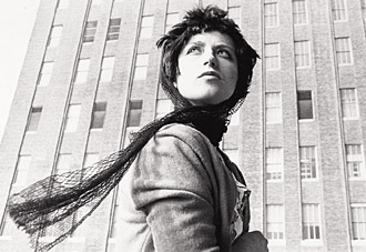
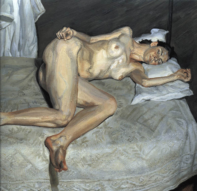
"Untitled Film Still #58"


Cindy's untitled film stills are my favorite ones from all of her collections. I love that she portrayed different people and scenarios. It also amazes me that she was able to get such wonderful shots of herself all by herself. Professor A. Skees showed us some of her work in our class and I just fell in love with it.
Cindy was born in 1954 in Glen Ridge, New Jersey. Unlike some budding artists Sherman wasn't involved in arts as a child and neither were her parents. Her father was an engineer and her mother worked as a reading teacher. It wasn't until college that Sherman began to gain any concept of the art world. Despite her parents lack of artistic interest they were supportive of her when she told them that she wanted to attend art school after college, although her mother did caution her to take a few teaching courses just in case. Sherman's exploration of art began at State University College at Buffalo. When starting college Sherman primarily focused on painting until one day she had had enough of it. Sherman stated that she could never have been a painter anyway because she was never able to react to a painting in anything more than a visceral way. She felt that she had done all that she could do with painting so she gave it up and instead focused her time on photography which is what she studied for the remainder of college. During this time is when she met someone who would become a very important person in her life, a fellow artist named Robert Longo. Sherman, Longo, and a fellow student named Charles Clough formed "Hallways", which was an independent artists' space where she and fellow artists could exhibit their work. Sherman graduated college in 1976 and soon moved to New York City to start her career in art. This is when Cindy Sherman began to take photographs of herself. These photographs would come to be known as "the Untitled Film Stills", perhaps the most well known and recognizable work of Shermans Career so far. These photographs were begun in 1977, and Sherman placed herself in B-movie actress roles, showing her dressing up in wigs, hats, dresses, and clothes unlike her own, where she was playing the role of characters. Many people mistake these photographs as self portraits but really they only play with the elements of self portraiture. In these photographs Sherman is playing a "type" not an actual person, but a fictional one. Sherman completed this project three years later because she ran out of cliches with which to work with. This series gave her much publicity and critical acclaim and landed her her first solo exhibit at the nonprofit space The Kitchen, in New York City. In 1981 Sherman was commissioned by the respected magazine ArtForum to do a centerfold piece. The work that she submitted was ultimately rejected by ArtForum's editor Ingrid Sischy who claimed that her photographs "might be misunderstood". After that Sherman went on to change her artistic style almost entirely in what is often referred to as the "Disaster and Fairy Tales series. This was the first time in Cindy's public career that she was not the model in all of the images. This series was shot from 1985 to 1989 and the images were considered to be more grotesque than her earlier work. For these works Cindy dresses to look scary and deformed, and she places herself in strange, undefinable settings which often featured oddly colored lighting. Cindy used doll parts or prosthetic body parts to substitute her own, and the scenes are normally strewn with vomit, blood, and any other disgusting substance. Shermans second best known work came sometime after the Film Stills were well received. This time she again is the model in her work but she casts herself in the roles of famous paintings. She didn't specifically reference any certain paintings but you could still feel the relationship between the great masters works and her own. She lived abroad during this time. In 1992 Cindy Sherman embarked on a new series which is now referred to as "Sex Pictures". This is the first time that Cindy is entirely absent from the photos. Instead she again uses doll parts and human prosthetic body parts which are all posed in highly sexual poses. These photographs were all done in color and they were meant to shock. In 1997 Sherman added film to her busy work career directing " Office Killer" In 1998 she also appeared in front of the camera making a cameo playing herself in John Water's comedy "Pecker".


http://www.cindysherman.com/biography.shtml

Artist #31 Damien Hirst


"Beautiful C Painting"

I like this painting of his because I like all the colors in it. It is a series of painting that was created on a spinning wheel. I think it is a very bold piece of work and that is what I like the most about it. I love paintings by artists who are not afraid to use bold bright colors. I like that he experimented with a spinning machine to create some of his paintings. Hirst's work is based on life and death and to me this on represents life because the bright and bold design make it come to life on the canvas.


Damien was born on June 7, 1965 in Bristol England. He now lives in Devon, UK. He studied at Goldsmith's College in London. In 1988 Damien curated an exhibition of his work and that of his contemporaries with still attending college. This exhibition is believed to have been the starting point of Damien's artistic career, and a defining moment in kick starting cutting edge British contemporary art. Damien's work confronts the scientific, philosophical, and religious aspects of human existence and it included sculpture, painting, and printmaking. In 1995 he was awarded the Turner Prize for "The Physical Impossibility of Death in the Mind of Something living". In 2004 he collaborated with Sarah Lucas and Angus Fairhurst to exhibit recent works at Tate Britain under the title In-a-Gadda-da-Vida. In 2006 works from his murderme collection were exhibited at the Serpentine gallery, London :" In the Darkest Hour there may be light". Damien's works can be found in collections worldwide including Tate, London, UK, MoMa, Washington DC, Scotland, Netherlands, and much much more.


https://www.othercriteria.com/browse/hirst/


Sunday, July 31, 2011

#30 Marilyn Shafer Bush

"After the Rain"

Acrylic on Clayboard


She is an artist after my own heart. I love everything about the country and I am also touched by the old barns in fields. It amazes me the beauty of what the barns of the past represent to us in the future. That is why I picked this painting of hers as my favorite "after the rain". I love the barn that she painted in this one, I love that it is white and so small and simple. The road that is filled with water is very beautiful too, i love the reflections that she created in the standing water from the rain. She has a very good sense of light and she portrayed it very beautifully in this painting. I love the colors that she used to create the field and landscape.


As a child Marilyn always knew that she was an artist and at the age of 12 she began to draw with the encouragement of her parents. Marilyn never attended college and most of her painting skills are self taught. Marilyn tries to paint everyday by finding inspiration in everyday life. She also enjoys teaching young children how to paint and teaching them how to "see" like and artist does. She really enjoys painting landscapes and snow scenes in acrylic. She finds inspiration in the people that she meet in the area that surrounds her. She loves to ride through Lancaster Pa area and looks at all the old barns and the simple way of life. The Lancaster area to her has a quiet beauty about it, untouched by technology while holding on to the memories of the past.


# 29 May Fleihan


"beautiful lake"


I fell like her landscape paintings are the strongest of her collections she far. I love the texture that she used in the painting beautiful lake. The reflection of the water is very pretty. I also like that you can almost feel the wind blowing in the grass by the red flowers.


May received her Bachelor of Arts from the university of North Carolina at Greensboro. In 1999 was when May started her first ever painting. She says that it was the beginning of the discovery of her life, she found the joy of painting. She didn't study art in college but deep down inside she always knew that art was a great interest of hers she just never did anything about it. Then one day out of no where a friend of hers asked her to come with her to an artist friends studio to paint. With the first stroke of her brush she knew she had found her passion and she has been painting ever since. So far her medium is oil on canvas and she likes to paint realism because she doesn't like distorting beauty. She loves all natural forms such a landscapes and flowers but she is not limited to any subject in particular if her eyes love it then she paints it no matter what the subject it.

# 28 Weeda Hamdan

http://www.weedahamdan.com/2/Artist.asp?ArtistID=32737&AKey=K6CELP93

Weeda was born in Liberia and she lived in Las Palmas de Gran Canaries, Spain and Lebanon with her parents and siblings as a child. The mix of cultures and traditions from each country are a major influence on her design and art. Her interest in art began at the age of 10 and her relatives began to notice her talent. In 1988 she began to attend Lebanese American University where she majored in graphic design and took painting classes as electives when she could. In 2000 she moved to Texas with her husband and two daughters. In 2005 she decided to her Masters in painting and drawing through the Academy of art in San Francisco. Major influences on her work are Fauvists and the German Expressionist Eras, and artists such as Van Gogh, Jason Bowen, and Mary Cassett. Her paintings are a celebration of color and texture. She also likes to use bleeding art tissue paper when making her oil paintings

http://www.weedahamdan.com/2/GalleryMain.asp?GalleryID=93116&AKey=K6CELP93

I really like her painting called "reflection VI". I think that is it really cool that she uses tissue paper to add to her paintings. I like the texture and affects that the tissue paper create. The colors in her painting are very bold and beautiful. I like this one because it reminds me of a late summer rain or early fall when the leaves have begun to fall off of the trees and change colors.

#27 Eric Palson


"Cloud Appreciation No. 7"


I really like the cloud pattern that he was able to paint in this painting. I think that the contrast of the blue sky against the dark color of the tree makes this painting the most visually interesting. The sky is very dramatic in the painting. I like the texture that he was able to create in this painting. The clouds are very fluffy looking.


Eric Palson is an architect who runs a firm in rural New Hampshire. Both of his parents were artists and art teacher but he decided to take a more technical path by studying architecture at MIT and Berkley. He taught drawing and design at Berkley, University of Wisconsin, and at the Boston Architectural Center before going into practice. In his artist statement Eric says that he paints the things that he likes to study. He just stands in front of them and paints them. He says that he is usually drawn to a scene because of light, texture, color, form or the juxtaposition of opposites. When he paints hes tries to understand what is really going on or he tries to capture an elusive visual effect. He says when he paints he is not painting in a completely conscious way, but in a autonomous manner that is an escape from the left brain world of his professional life. He says when he paints he tends to get a lot of paint on himself and it is fun!


http://www.ericpalson.com/

#26 Angela Anderson

Angela Anderson is an artist from Russellville, Arkansas. She grew up in Palm Springs, California and moved to Arkansas in 1991 after graduating college with an Honors Art Degree from Arizona Western College in Yuma. Although grounded in the basics of art through her studies, Angela soon developed her own self taught style of painting with acrylics. Angela pursued decorative arts for a while but in 2004 she returned back to fine arts after her trip to France. She finds inspiration for her work in many things including music, a favorite movie, planting in her garden, childhood memories, and walking in the woods. She loves bold, graphic images with strong colors and elements of light and dark. Mood and color, contrast and harmony, simplicity and joy of discovery characterize her paintings. Impressionist art has always been a strong influence in her artistic expression, although her paintings have a more realistic feel, she enjoys leaving brush strokes and blurred edges to give a soft, painterly quality to her work. http://www.angelaandersonfineart.com/large-multi-view/Portfolio/54150-47-5440/Portfolio.html


The painting that I picked of hers is called "poppy days". I love the colors that she picked for that painting because I think that the blue of the sky and the red of the poppies work really well together. I am also a fan of bright bold colors and that is way her work appeals to me so much. She says she likes to create a mood with her work and I believe that this one does just that. The mood to this painting I believe is very happy and carefree and relaxed. I really like all the different colors in this painting and I like the composition of this painting.

http://www.angelaandersonfineart.com/index.php

# 25 Kimberly Conrad

"Days of Summer"

Acrylic on Canvas


After reading her artist statement and learning about her technique of painting I was interested to see how her technique would show in her paintings. I was drawn to this one initially because I could definitely feel the movement in this painting. I especially love the detail and texture in the sky of this scene. You can get a really good sense of the movement that she had to do with her body to make to clouds seem as fluffy as they seem. I really like the detail in the sand too, her choice of colors to create the depth work really well. This painting definitely makes me want to take a trip to the beach.


Kimberly is a contemporary landscape artist. She is fascinated by color so she likes to make paintings with bright colors. Kimberly is a full time artist who devotes most of her time painting and teaching in her Colorado studio. She has painted on every surface imaginable but she primarily paints on canvas, paper and board. She has a diverse style and she says that she has the heart of an Abstract Expressionist or even an Action Expressionist. She is an action painter. She has a unique way of applying paint to her paintings especially for her landscapes, seascapes and aspens. Kimberly like to pour her paint, and manipulate it with water and body movement.

http://kimberlyconradfineart.com/

Saturday, July 30, 2011

#24 Annie Phillips

This work is a batik and it is from her series entitled "funky flowers". I really like this work because it is so simple but so pretty. I like that she painted the same leaves in all three batiks but she used different colors for each. I like this because I am most attracted to work that is playful and fun because I like to do work with the same style and feel to it.


Annie has been a batik artist for 25 years. She says that batik is her passion, vacation and also her work. She is continuously enthused by the process and finds it relaxing and freeing. Annie likes the medium because she is able to constantly stretch the medium. She likes that she can try to break down the boundaries of traditional batik and discover new areas and techniques. Unlike most artists Annie doesn't have any pre conceived notion on what her works will look like in the end when they are done. She likes to describe it as a magical mystery tour. She describes her creative process like a game of chess, one line leads to the next which then dictates what color should be used in the next part of her journey. Annie likes to create with organic lines.


#23 Paul Simmon

This is one of Paul Simmon's works that I like. I like that it is very simple and not very concerned with extreme detail. You can definitely feel that island flare that he is trying to portray in his artwork. You can feel the laid back feel of the island from the men sitting together enjoy a beer to the woman walking by carrying the basket of fruits on her head. I like the bold bright colors that are also typical in the tropics and I like his use of border.


Paul was born and raised in the UK. In 1970 when Paul was 21 he moved to the Caribbean, more specifically the island of St. Lucia. Paul first learned about batik while he was on a flight, that is where he read about it in an in flight magazine. In 1980 Paul was commissioned to make a number of pieces for a friend which lead to further commissions from people such as David Bowie, Mick Jagger, and Princess Margaret. In 1981 his work was shown at the world bank in Washington DC. Since then Paul has created and managed several restaurants and batik studios on the island, many which combine food and art which make for a very colorful cuisine. His inspirations for his work come from the natural beauty of the island such as the tropical rain forest and its birds and flowers. He likes to give a Caribbean flare to his work.

Friday, July 29, 2011

#22 Julie Komenda

Julie has been practicing the art of batik for 30 years. She learned the art while she was a student in Miami Florida. Julie likes the art form because of the many mediums that you can use to create with such as the different dyes, waxes and she even uses different papers to create on. Julie's subjects include sports, still life's, landscapes, portraits and the mermaids of Weeki Wachee.Natural and environmental themes are also included in her work from endangered species, weather, and fire.


http://1-julie-komenda.artistwebsites.com/featured/2-once-a-mermaid-always-a-mermaid-julie-komenda.html

Once a mermaid always a mermaid is the piece of work that I enjoyed the most of hers. I like to sort of organic feel that it has to it. I also like that it is a batik that is created on handmade paper and not just on fabric. The fact that she did not make this piece extremely detailed works really well because of the fact that the mermaids are under the water and moving. I like that you can see the movement of the water while one of the girls is in the process of doing some kind of flip in the water. I really like the giant air bubble that she painted coming out of the one mermaids mouth, and how she was able to recreate the water bubbles that surround the girls while they are doing their routine in the water it gives the painting wonderful texture.

http://1-julie-komenda.artistwebsites.com/index.html

#21 Wendy Tatter

"Trigger Fish"


I really like this batik of hers because of all the detail that she put into it. I especially like the shine that she was able to give to the fish. The composition of this batik is really nice, i like the face that you can't see all of the fish. In a way it keeps your guessing and it makes you want to see more, like you kind of expect the fish to finish swimming by you. I think she also did a really good job with the colors and using shading. I love the feel of all of her work it makes me feel like I am on vacation or that I wish that I could so to the Caribbean to experience all of natures wonders. I like that she paints things that she has actually seen and experienced so that her work is more personal to her.


In 1980 Wendy attended Instituto Allende is San Miguel, Mexico where she was introduced to the art of batik. The process of creating batik intrigued her because she saw it as an almost backward way of creating a design. The process intrigued her so much that it has been her main source of her creative outlet ever since. Wendy's work all has somewhat of a Caribbean flair because her work is inspired by places that she has been and loved and she has traveled extensively throughout the Caribbean and Central and South America. She has made her home now in Saint Augustine, Florida where she now owns her own gallery.

http://www.wbtatter.com/Bio.html

Artist #20 Echo Ukrainetz

"Potomic Gold"


Of all the subjects that Echo focuses on a like the landscapes section the best. I really can relate to this batik because I am from the country and see this scene pretty often so that is why I decided to talk about it. I love that she focuses on the round hay bales with the most detail because that it what she is trying to have be the main focus in this batik. I really like the texture the she was able to create with the hay field you can tell that it is still flowing full of hay. I also like that she is not afraid of the cracks and crinkles that are typical in batik and they actually seem to make composition stronger.


Echo is a native from Montana where she taught history, art and Spanish. She began her work in Batik in 1992. She enjoys the many aspects of the medium that she is able to experiment with. She has a large variety of subjects that her batiks focus on and she has work in collections all throughout North America. Some of her work is a collaboration between her and her husband.


#19 Sarah Hale

"Gull Lake Island"

Batik on Cotton

I picked this piece of hers because I haven't seen very many batiks from artists who appreciate the unpredictability of wax when dying. I think that the crackle really works with the batik because it almost looks as if it could be reflections from the trees or something onto the water. I think Sarah did a good job creating the rippling effect in the water and the reflection of the trees.

Even from the age of 10 Sarah Hale always expected to become a famous artist. Sarah Hale first learned about Batik when she was living in Japan for a year. After moving to Arden, Canada Sarah took a basic class in batik. It was not long that she learned that she loved the process and enjoyed the finishes product because she was able to depict landscape in a way that was fresh and new. She also liked it because people liked her work and bought it which meant that she had the money to do more. Not to long after batik became a family business where her and her late husband worked together for 20 years and did work for major retail and craft shows. Sarah does both tub dying and the paint on method. She likes to focus on the landscape in Ontario as well as the native birds and flowers.

#18 Dorothy Bunny Bowen

http://www.db-bowen.com/index.htm

Dorothy started out as a painter and art historian. She received her BA in studio Art from Randolph Macon Woman's college in Lynchburg, VA and her MA in Art History from the University of New Mexico. In 1980 is when Dorothy discovered batik after working as a textile research associate at the Museum of International Folk Art for 10 years. She likes batik because it combines her love for textiles and her training as a painter. The theme that Bowen likes to focus on in her work is water. She lives the in Dessert in the Southwest so she says she is very aware of every drop that falls, flows, or evaporated anywhere nearby. Dorothy is a believer that we should live lightly on this earth and live in awe of its magnificence and she hopes that this belief is present in her artwork.
http://www.db-bowen.com/recent/recent-album/pages/morning_glory.htm


The image that I picked of her work is called God's Glory in the morning. I love the colors in this work. I love how it is depicting to morning glories in the morning as the orange glow of the sunrise is in the background. She did a really good just at making the orange in the background glow. It is also nice that she didn't feel the need to show every little detail such as in the leaves and the flower pedals but that you are still able to tell exactly what kind of flower it is even if she hadn't told us in the title.

#17 Inga Titova


Scarf "Happy Birthday"


I picked this scarf because I loved the colors and the scene that was depicted in it. This scarf is made on real silk using the cold batik method. I couldn't get the picture to blow up any bigger but from what I can tell it looks like fairies and flowers. It is amazing the detail that she created in this painting with lots of textures and tones. I like the colors that she uses in her works they are very happy and bright.


Inga was born in Karpinsk (Bogoslovsk) of the Sverdlovsk. When she was a child she entered a children's school of art where she studied for 5 years. After the 8th grade she studied in a musical school where she focused on mainly accordion and piano. After school Inga worked at a secondary school as a music teacher. At the beginning of the 1990's she studied at the Art School of Valadivostok simultaneously taking part in exhibitions in Germany and Russia. She then studied at Amur State University in the design department. While studying there she taught at a private school teaching 6 year old children to paint. Today Inga Titova is a free artist and her works can be seen in private collections in Germany, Russia, and China.


#16 Alla Sviridenko

"1eva1"

http://www.allasilk.org/en/home


I picked this batik of Alla's because I like the simple colors that are in it. I also like that she uses words to create texture in this batik. Her use of the female form is very beautiful in this batik, simple but elegant. The colors go well with the water and wind theme of this batik. The texture of the ripples in the water work very well and i like that she uses words to curl around the waves and accentuate the ripples. Sometimes the most simple analogous color schemes work the best to make the biggest statement. Simple but beautiful.

Alla is an artist, professor, and designer who works in the techniques of batik and silk painting. The main directions of her work are fine arts, interior and fashion design. Alla was born in 1958 in Belarus. Alla received an education as a architect, artist, and teacher of arts. Alla works in the techniques of batik, silk painting and Shibori. Her favorite themes are flowers, herbs, female image and landscape. For Alla batik is not just a textile craft or a direction in decorative arts, but a philosophy, her world outlook. In batik in general Alla found an optimal form of creative self expression. Alla likes that silk painting allows space for improvising. Alla strives to achieve harmony of color, form and image.

Artist #15 Leo Twiggs

http://leotwiggs.com/leotwiggs.com/Media/transparent.gif

http://leotwiggs.com/leotwiggs.com/Home_Page.html


I selected a work from his Hugo Series to talk about for this post. The work is called Phillips Gate and it was made in 1990. I liked this series the most out all the ones in his gallery because I felt like it was the most playful. All of the works in this series are of images and people almost in a blur from moving way to fast or even like they are vanishing. Phillips gate is a very simple batik but I really like how Leo made the gate as simple as he did by just outlining it with the wax and then using color the most in the blur of the figure. This piece of work has a very whimsical feel to it but all the lines in it are very beautiful. I love that the color in the work is very limited and that it is mostly concentrated on the "blur" of the figure. I feel that this helps to bring your eye to that corner and that is what makes this piece of work so interesting.


Leo Twiggs was born in St. Stephen, South Carolina and received his BA from Claflin University. Later Leo went on to study at the Art Institute of Chicago and later received his MA from New York University, and his doctorate in Art Education from the University of Georgia. Leo Twiggs was the first visual artist to earn the Verner Award for outstanding contributions to the arts in South Carolina. Twiggs paintings are done with a unique innovative technique that he developed after years of experimenting with the traditional medium. Twiggs has has 70 one man shows and his work has received international recognition. Leo's work has been published in many art textbooks and featured in several television documentaries. In 2002 and 2008 he was selected to design ornaments for the White House Christmas tree.


Artist #14 Henry Sumpter

Henry was born in Myrtle Beach South Carolina in 1945. As a child Henry enjoyed meeting people from different parts of the world. As he grew his interest in art he grew a relationship with James H. Burroughs a noted local artist. The relationship grew into a four year scholarship and lead to many awards. Henry attended Chaflin College where he was introduced to batik master Leo Twiggs who taught at a neighboring college. It was during this time that Henry fell in love with the batik process. Briefly Henry worked in the Army as an artist during the Vietnam era. After the army Henry attended graduate school and then began to teach in the south, continuing to refine his art and coming up with new techniques for producing batiks. Henry likes to create paintings from dreams, tv, readings, and a vivid imagination of places that he has visited. Henry likes to leave the interpretation of his work up to the viewer.

http://www.visualdesignstudio.com/hiddentreasures.htm

I really like the piece of work by Henry Sumpter entitled Hidden Treasures. This work is the first painting of a series of paintings about people who toil in the soil. I like how Sumpter's work has a lot of detail without feeling the need to try to depict every little detail such as the one's in the faces of all the workers. I like how he used to circle to kind of highlight the story of what is beneath the soil that the workers can't see but we can, I think that is what gives this batik the most visual interest. I also like the technique that he used in the background so that he didn't have to depict everything that would be in the background. It fits in perfectly with the painting.

Artist #13 Elena Vedernikova

"spring"

I think that Elena Vedernikova is my new favorite batik artist. I love that she likes to use bold bright colors. Her work also appeals to me because she likes to use femine figures and objects in her work and the way that she uses it all together is very beautiful. My favorite painting of hers is this one called spring. I find it very delicate and beautiful. I love the fact that you can't see the womans face in this painting. I also love that she used the flowers in the womans hair that she also continued to use as a background. The transition of the hair into the grass flows perfectly. I love the texture Elena put into the dress. It is a very happy painting and it makes you want to go sit in a field of flowers on a warm end of the day.


Elena Vedernikova is a Russian Batik artist. She specializes in cold batik. Elena graduated from Udmurt State University in Izhevsk, Russia where she specialized in textile arts and silk painting. Since graduating Elena has worked as a batik artist and her works can be found in private collections in Germany, France, Italy Greece, Russia, and the USA. Elena creates work with the idea of being able to perceive her painting in two ways: the external contemplative method and the internal method of interpreting the artists intentions. Most of Vedernikova's paintings address the theme of femininity and a multitude of it's variations. Elena's visual style is original, with the smooth flowing vibrant lines that seem endless, capable of creating many images on the way.


http://batik-cold.narod.ru/

Artist #12 Sam Kurana

"Discarded"

This batik is done with the technique that Sam called Dyetik. He says that it gives batik more detail than typical batik but I feel that It makes his work look like it is colored pencil. I have never seen batik with this kind of texture before and I am interested to know how he does it. I think that it has beautiful texture. I like that colors that he was able to achieve in the grass and on the ground. I like that cars in this batik too and the depth that he created with them but I feel like they kind of just stick out because the grass has so many different details and colors and the cars are just red and white. I feel like he could have done something else to make them more interesting and not stick out so much.


Sam is considered to be one of the heroes of Malaysian Batik. He grew up in Perak but found his place early as an innovative Batik artist in the contemporary batik heartland of the state Penang. Penang is where most batik giants found their inspiration and where their talents were recognized. Sam is well known at home as well as abroad. Sam teaches Batik Fine Arts training for foreign art teachers, students, and batik enthusiasts. Sam has been a practicing artist since the 60's but didn't originally start out as a batik artist. Originally Sam focused in watercolor and oils. Sam believes that his appeals lies in the fact that he has taken the medium farther than his peers before him. Sam is concerned with receiving credit for originality for his technique that gives his painting detail that is not normally achieved in batik so he has guarded the details of his technique. Sam doesn't rely on defined segmented figures and scenarios which to typically common with batik painting. He successfully adapted a unique technique that gives his paintings a mottled surface glow that he calls "dyetik".

Wednesday, July 27, 2011

#11 John TInger


John Tinger grew up in Massachusetts and now lives in Oakland California. John started out with a degree as a civil engineer. It was only when working for the peace corps as a volunteer in Uruguay, South America that John began to learn the techniques of batik. He likes batik because of the random results that it produces that are only completely revealed in the final step. He likes the art form because he can use bright colors and simple shapes to create complex designs. He also likes batik because you you don't have to worry about little details as much. Like most batik artist John believes that there are no mistakes in batik, all the drips, cracks, and dye spills are all part of the creative process. John likes the concept of using very old, traditional media for contemporary stylized images. His inspiration is based on his interests in music, sports, architecture, engineering and the outdoors. Recently John has begun to bring some of his engineering background into his batik work by creating mixed media using three dimensional structural and truss components to lay over the batik.


http://www.batikfineart.com/


John's style is a lot different from the other artists that I have looked at so far. He isn't concerned with putting all the little details into his art. I like that he has some that he tries to do with a little more detail and that he also does batiks with less detail. I like both ways but sometimes I think that to much detail can take away from the piece of work so sometimes its nice to just go as simply as possible as long as you can still get the subject of the work to be depicted clearly enough. My favorite of his work is the batik of the spider. I like all the colors that he used in it and I also like the border that he created. I like that the spider is so simple but you can still tell that it is a spider and that he also did give it some detail but it is the most simple detail that you can give. I really like how he did the spider web too. The web is very detailed and the colors behind it work very well in this batik.


#10 Beth McCoy

Beth McCoy was raised in Washington D.C. and Maryland in a family of art lovers. When she graduated high school she did little odd jobs until she stumbled into painting and then in 1990 she fell in love with batik while she was designing and painting hand painted apparel in her Colorado shop. She was entralled by the process of drawing, waxing, dying and then over dying. She began to experiment on clothing and table linens at first. A couple years later when visiting a gallery she saw some very realistic batik paintings which moved her to take her work beyond the simple decorative motifs she previously had been doing. She is self taught with a lot of trial and error and travels the world to gather inspiration for her work. In 2006 she began experimenting with batik pointillism.


http://www.batikartbybeth.com/index.php


http://www.batikartbybeth.com/graphics/ro/Mother%20and%20Baby.jpg

The batik painting of hers that I decided to talk about is the one called "mother and baby". She took this photo one the streets in Delhi but she altered the background from a busy city street to greenery. I really like the fact that this artist experiments with different techniques and I love that she is experimenting with pointillism. Personally I think that it makes the portrait that much more interesting. I love all the colors that she was able to create by putting certain dots together in certain ways. I also like the fact that she changed to background to greenery because I feel it makes it easier for me to focus on the subjects in the painting with are the mother and baby and if she had kept the background of the city it would have been entirely to distracting. I love that texture that pointillism with batik creates and I like that she was still able to create depth in the portrait as much as she was by just using little tiny dots.

#9 Ada Florek

"Batik VIII"

What I have noticed from Ada's batik work is that she likes to use colors that are more muted and not so bold. Most of the work that I looked at by her was abstract but she did have some that were not. I chose this batik because I really like that texture that was created in this. The tree bark was recreated very well and it looks just like actual tree bark. I also really like the texture that was created in the sky. The clouds look so bubblely and soft. I really like the colors that she used in this batik.


Ada doesn't focus on just batik work. She looks to draw and paint too. She has work that focuses on architecture, still life and other various things. Ada is from Poland and she is a new artist.
She is so new I guess that I searched all over on the internet for an artist statement or a biography and I wasn't able to find anything.

Tuesday, July 26, 2011

#8 Leonard Thompson

This batik is called "Tulipa Groenland" it is done on silk and mounted on a 50cm square. I love this piece because of the wonderful lighting and detail that he was able to capture. I love all the multiple different shades that were used just in creating the flower petals themselves. Leonard was able to use a water wash very well and create the different tones and shades. This piece of work is amazing because it looks so real. I really like the texture that he was able to create especially with the greenery.


Leonard Thompson started out as a teacher and taught primary school for 32 years but he decided to take an early retirement so that he would have time to produce his own paintings since teaching left him with little time to do so. Leonard likes to work with mostly colorful birds and flowers because he believes that they suite his approach to silk painting the best. Leonard likes to work with silk the most and sometimes he uses wax to create batik techniques in his work. Unlike most batik artists through he doesn't like the outlines that the wax creates so he works to hide the outlines in his finished products which he says is best from him because it fits his personality. Leonard says that his designs are mostly figurative because he likes to give his audience something to ponder.


Artist #7 Mary Lee Murphy

When Looking through the gallery of her work this one caught my eye the most. It is called "Rock in Sea, Connemara" I really like the colors that she picked for this Batik. I think its interesting that she used orange as an accent for the rock in the sea. I think that that texture that she created for the water is very pretty too, I ould tell it was water before I even looked at the title, i think it is a very interesting interpretation of water ripples. Also, the reflection of the rock in the water is done very nicely. You can tell that she depicted this scene when it was darker in the day time, probably at sunset or on a cloudy day.


Mary Lee Murphy is a Batik artist. Also she does not like to be considered that. She like that tell people that she is a painter and that her medium is dye and wax. She is a leading contemporary Batik artist from Ireland. She studied fine art in Sligo which is where she current works out of her studio in the country side. Mary's work is widely acclaimed and is on display in many public and private collections. Her subject matter that she liked to work with is landscape and the human form which she uses to express what is inside her. Mary like to work with a variety of clothes such as cotton, silk, and linen. She likes to apply the wax in her batiks with brushes.