Wednesday, July 27, 2011

#11 John TInger


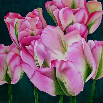
John Tinger grew up in Massachusetts and now lives in Oakland California. John started out with a degree as a civil engineer. It was only when working for the peace corps as a volunteer in Uruguay, South America that John began to learn the techniques of batik. He likes batik because of the random results that it produces that are only completely revealed in the final step. He likes the art form because he can use bright colors and simple shapes to create complex designs. He also likes batik because you you don't have to worry about little details as much. Like most batik artist John believes that there are no mistakes in batik, all the drips, cracks, and dye spills are all part of the creative process. John likes the concept of using very old, traditional media for contemporary stylized images. His inspiration is based on his interests in music, sports, architecture, engineering and the outdoors. Recently John has begun to bring some of his engineering background into his batik work by creating mixed media using three dimensional structural and truss components to lay over the batik.


http://www.batikfineart.com/


John's style is a lot different from the other artists that I have looked at so far. He isn't concerned with putting all the little details into his art. I like that he has some that he tries to do with a little more detail and that he also does batiks with less detail. I like both ways but sometimes I think that to much detail can take away from the piece of work so sometimes its nice to just go as simply as possible as long as you can still get the subject of the work to be depicted clearly enough. My favorite of his work is the batik of the spider. I like all the colors that he used in it and I also like the border that he created. I like that the spider is so simple but you can still tell that it is a spider and that he also did give it some detail but it is the most simple detail that you can give. I really like how he did the spider web too. The web is very detailed and the colors behind it work very well in this batik.


#10 Beth McCoy

Beth McCoy was raised in Washington D.C. and Maryland in a family of art lovers. When she graduated high school she did little odd jobs until she stumbled into painting and then in 1990 she fell in love with batik while she was designing and painting hand painted apparel in her Colorado shop. She was entralled by the process of drawing, waxing, dying and then over dying. She began to experiment on clothing and table linens at first. A couple years later when visiting a gallery she saw some very realistic batik paintings which moved her to take her work beyond the simple decorative motifs she previously had been doing. She is self taught with a lot of trial and error and travels the world to gather inspiration for her work. In 2006 she began experimenting with batik pointillism.


http://www.batikartbybeth.com/index.php


http://www.batikartbybeth.com/graphics/ro/Mother%20and%20Baby.jpg

The batik painting of hers that I decided to talk about is the one called "mother and baby". She took this photo one the streets in Delhi but she altered the background from a busy city street to greenery. I really like the fact that this artist experiments with different techniques and I love that she is experimenting with pointillism. Personally I think that it makes the portrait that much more interesting. I love all the colors that she was able to create by putting certain dots together in certain ways. I also like the fact that she changed to background to greenery because I feel it makes it easier for me to focus on the subjects in the painting with are the mother and baby and if she had kept the background of the city it would have been entirely to distracting. I love that texture that pointillism with batik creates and I like that she was still able to create depth in the portrait as much as she was by just using little tiny dots.

#9 Ada Florek

"Batik VIII"

What I have noticed from Ada's batik work is that she likes to use colors that are more muted and not so bold. Most of the work that I looked at by her was abstract but she did have some that were not. I chose this batik because I really like that texture that was created in this. The tree bark was recreated very well and it looks just like actual tree bark. I also really like the texture that was created in the sky. The clouds look so bubblely and soft. I really like the colors that she used in this batik.


Ada doesn't focus on just batik work. She looks to draw and paint too. She has work that focuses on architecture, still life and other various things. Ada is from Poland and she is a new artist.
She is so new I guess that I searched all over on the internet for an artist statement or a biography and I wasn't able to find anything.

Tuesday, July 26, 2011

#8 Leonard Thompson

This batik is called "Tulipa Groenland" it is done on silk and mounted on a 50cm square. I love this piece because of the wonderful lighting and detail that he was able to capture. I love all the multiple different shades that were used just in creating the flower petals themselves. Leonard was able to use a water wash very well and create the different tones and shades. This piece of work is amazing because it looks so real. I really like the texture that he was able to create especially with the greenery.


Leonard Thompson started out as a teacher and taught primary school for 32 years but he decided to take an early retirement so that he would have time to produce his own paintings since teaching left him with little time to do so. Leonard likes to work with mostly colorful birds and flowers because he believes that they suite his approach to silk painting the best. Leonard likes to work with silk the most and sometimes he uses wax to create batik techniques in his work. Unlike most batik artists through he doesn't like the outlines that the wax creates so he works to hide the outlines in his finished products which he says is best from him because it fits his personality. Leonard says that his designs are mostly figurative because he likes to give his audience something to ponder.


Artist #7 Mary Lee Murphy

When Looking through the gallery of her work this one caught my eye the most. It is called "Rock in Sea, Connemara" I really like the colors that she picked for this Batik. I think its interesting that she used orange as an accent for the rock in the sea. I think that that texture that she created for the water is very pretty too, I ould tell it was water before I even looked at the title, i think it is a very interesting interpretation of water ripples. Also, the reflection of the rock in the water is done very nicely. You can tell that she depicted this scene when it was darker in the day time, probably at sunset or on a cloudy day.


Mary Lee Murphy is a Batik artist. Also she does not like to be considered that. She like that tell people that she is a painter and that her medium is dye and wax. She is a leading contemporary Batik artist from Ireland. She studied fine art in Sligo which is where she current works out of her studio in the country side. Mary's work is widely acclaimed and is on display in many public and private collections. Her subject matter that she liked to work with is landscape and the human form which she uses to express what is inside her. Mary like to work with a variety of clothes such as cotton, silk, and linen. She likes to apply the wax in her batiks with brushes.


Monday, July 25, 2011

#6 Modern Batik Artist David Kibuuka

My absolute favorite work of David's that I found so far is this top batik painting called Hypnotise 3. I absolutely love his technique because it enable you to give your subjects depth which you can't normally do using the regular techniques of batik. I love how the face recedes into the black shadow in the background and how the face looks 3D. I also like that with this technique you can you many different colors. It amazes me how the lines in his work are so crisp and clean, you can't tell that it is even done on fabric it looks like it is a painting done with paint on a canvas.


Davids technique is very interesting to me. When I learned to do batik work I learned that you go from the lightest color to the darkest color. David and his brother Henry instead use the opposite technique which was pioneered by Henry. He starts with the darkest colors and works to the lightest. Also, instead of using full strength dye and dipping the fabric in it, Henry used diluted dye and painted it on the fabric allowing him to get detailed images with refined edges with dramatically enhanced tonality, shading and depth. David introduced the Fragmentation technique to this medium. This technique added increased background depth, a broader and richer color palette to the color palette of batik painting. This technique allows for control, richness, and detail comparable to acrylic and water color painting. This modification has been called " Modern Batik Art Painting". David Kibuuka is originally from Uganda. In 1976 David left Uganda to attend art schools in Nairobi, Kenya. In 1983 David moved to Ontario Canada where he finished his studies at Ontario College of Art and Design.http://kibuuka.com/default.asp


Wednesday, July 13, 2011

#5 T.G. Tarnowski


"Out of Business Store Window"


While searching online for some new contemporary nature photographers I recently stumbled upon an artist with an interesting concept. T. G. Tarnowski is an artist who likes to document accumulating absences. In reading the home page of Tarnowski's website there is an article written by a New York Times writer that describes Tarnowski's work. It talks about how we all have places in our lives that we pass through. Things grow and change and yet we still remember them like they were when they were part of our lives. The article talks about a corner Korean Market that had closed and the writer had a hard time dealing with the change. The writer walked passed it even when it was boarded up and could still imagine where everything was in the store they used to go in there for. The article talks about how all of us carry footprints of vanishing places such as old apartments that we used to live in, Restaurants that went out of business and other such places. The point in this article that I find most interesting and that has a very good concept is when the writer talks about these vanishing places and says basically that these are " places we knew almost by intuition until they vanished leaving behind only the strange sense of knowing our way around a world that can no longer be found."

T.G. Tarnowski's work is very interesting. He doesn't have much of an artist statement online but from what I can tell from looking at his work he likes to deal with the concept of vanishing places. The image I chose for this artist that was my favorite is called "Out of Business Store Window". This one is the most appealing to me of all the photos in his gallery because it speaks the most to me about vanishing places and what was once there that is now gone. You can tell that a lot of people were once part of the history of this business by the multiple pieces of tape that are still left on the window. That means that many people must have come and posted advertisements and other things in this businesses window and that people in this town must have come to this store looking for information on things. I love that this photograph is so simplistic but yet it tells many different stories.